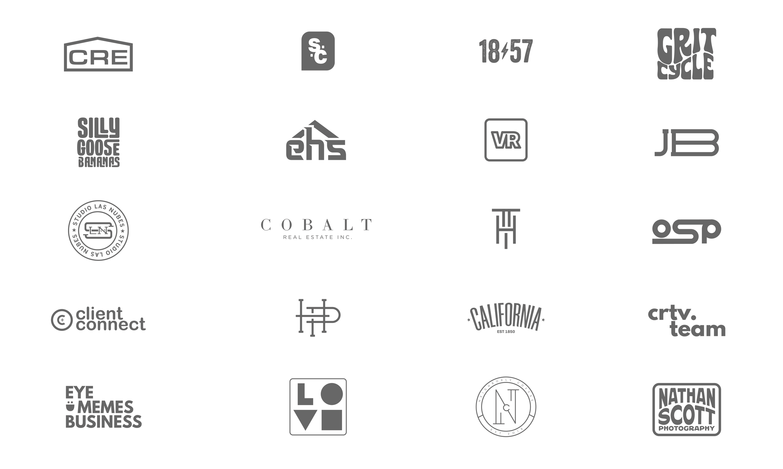
Logos and Lockups Overview
A great logo is more than just a pretty mark—it’s a brand’s handshake, its flag, its first impression. This collection showcases a range of logos, wordmarks, and icons developed for clients across various industries—from fitness and real estate to fashion, tech, and nonprofit. Whether it's bold and loud or minimal and refined, each mark is built to capture the essence of a brand and hold up across digital, print, and apparel applications.
Studio Las Nubes
The logo for Studio Las Nubes combines the initials "SLN" into a unified circular form, reflecting the studio’s name, which means "the clouds" in Spanish. The stars within the design evoke the sky, symbolizing creativity and aspiration. This elegant and balanced mark captures the studio’s essence, creating a memorable identity that aligns with the brand’s artistic mission.
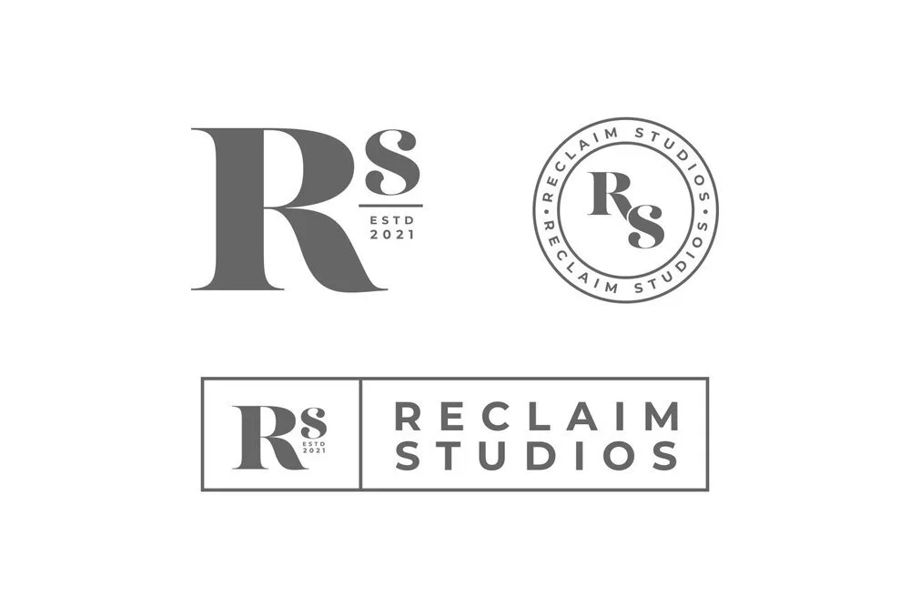
Reclaim Studio Suite
Reclaim Studio’s logo suite includes three versatile variations, each representing the studio’s dedication to helping artists reclaim their creativity. The circular logo merges the "R" and "S" in a seamless form, symbolizing the blend of music and art. The bold "R" with the smaller "s" and "Est. 2021" conveys confidence and establishes brand presence, while the horizontal logo allows for adaptability. Together, these logos create a cohesive identity that reinforces the brand’s strength and vision.
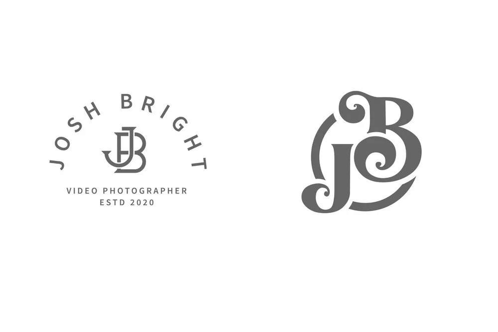
Josh Bright Video Photographer
For videographer Josh Bright, these two final logo concepts offer versatility and simplicity. The primary logo features his name, title, and established year, projecting professionalism on business materials. The secondary logo, a sleek monogram focusing on the "J" and "B," provides a distinctive mark ideal for personal branding, ensuring a strong and recognizable identity across various platforms.
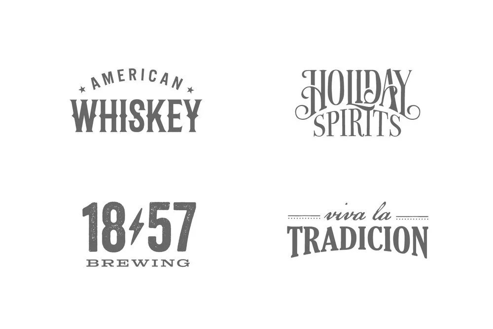
Spirits and Brews Wordmarks Collection
American Whiskey: This wordmark, accented with stars, represents American-made whiskeys at trade shows, emphasizing heritage and craftsmanship.
Holiday Spirits: Created for national end-cap displays in Rite-Aid stores, this festive wordmark evokes holiday warmth and celebration. Paired with recipes, it entices customers to incorporate these spirits into their seasonal traditions.
1857 Brewing: Designed to honor a family recipe from 1857, this logo underscores tradition and quality, appealing to those who value artisanal brewing.
Viva La Tradicion: Translating to "It’s a living tradition," this Spanish-inspired wordmark was developed for a concept restaurant, promising an authentic cultural and culinary experience.
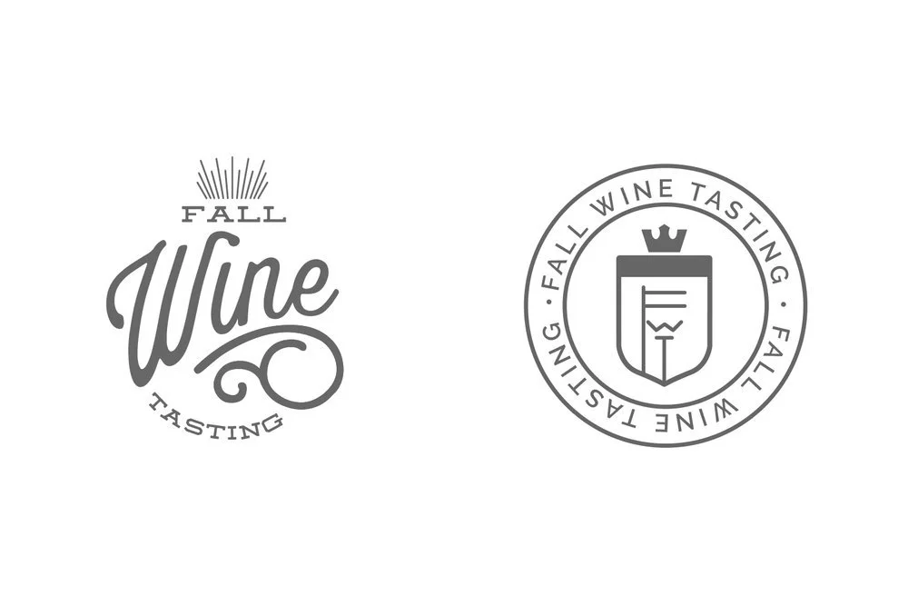
Fall Wine Tasting Logos
Developed for an annual fall wine conference, these logos communicate the sophistication and elegance of the event. Used across invitations, banners, tasting menus, and other materials, these logos ensure a cohesive and distinguished look, reinforcing the premium nature of the conference and leaving a lasting impression on attendees.