
GRIT CYCLE: Logo Design & Apparel Branding
GritCycle isn't just an indoor cycling studio—it’s an experience. Loud, dark, high-energy, and unapologetically intense. The brand needed an apparel identity that matched that energy—something versatile enough to live on stickers, sweatshirts, and laptops, while still feeling authentic to the studio’s culture.
THE CONCEPT
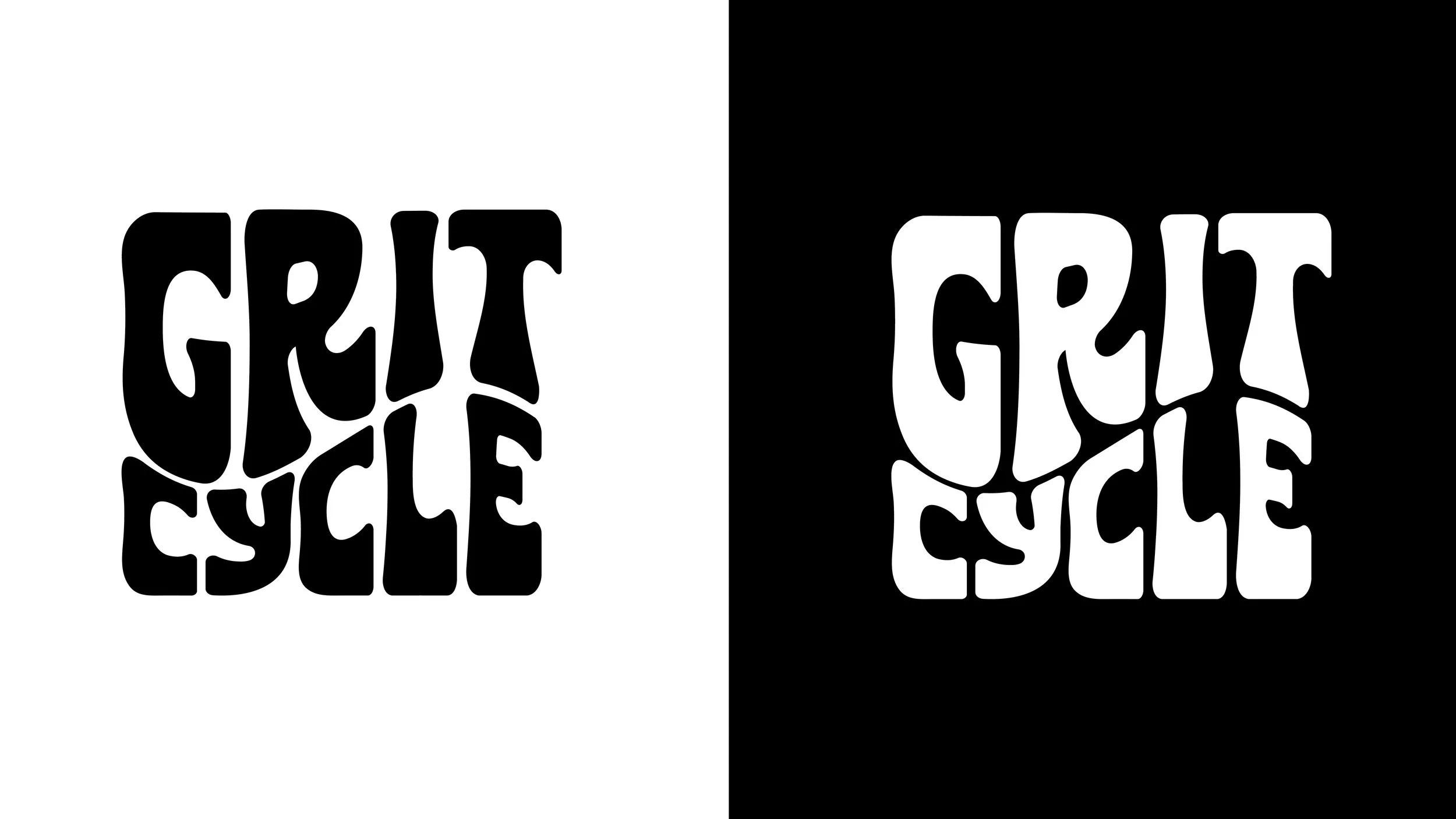
The design direction centered around bold, distorted typography that visually captured the rhythm and intensity of a GritCycle class. The letterforms evoke a retro, 1970s-inspired aesthetic—sweat, soul, and movement—reimagined for today’s modern fitness community. The logo needed to feel kinetic, even at rest.
THE PROCESS
The development phase focused on evolving the typography from clean and legible to increasingly expressive.
Each iteration introduced more character:
A straightforward layout for clarity
Increased weight for greater impact
Strategic distortion to convey motion and rhythm
A final lockup that blends grit, groove, and confidence

THE OUTCOME
The finished logo quickly became a visual staple for the GritCycle community. Featured on merchandise and accessories, it helped shift the brand’s presence from boutique fitness to bold lifestyle.
Seen across:
Custom-cut vinyl stickers for tech and water bottles
Bold sweatshirt prints for in-studio retail
Real-world application worn proudly by riders and staff